Brand Guidelines
How we look and sound
A single source of truth for the Sweater identity — the logo, the palette anchored on the espresso tile, the type pairing, and the spacing rhythm that ties it all together.
Logo
The lockup is a rounded espresso tile carrying a white double-chevron knit mark, paired with the Cormorant Garamond wordmark — a single semibold "Sweater". An optional tagline, weather, worn well, may sit beneath the wordmark in muted italic. The mark and wordmark are always lockup-together except where the mark stands alone as an app icon.
Do
- ✓Use <BrandLogo /> and <BrandMark /> — never re-create the SVG inline.
- ✓Keep clear space around the lockup equal to the tile's height.
- ✓Use the mark-only tile for favicons, app icons, and avatars.
Don't
- ✕Don't change the tile color, radius, or chevron glyph.
- ✕Don't substitute the wordmark font or set both words italic.
- ✕Don't place the lockup on a busy photo without a contrast scrim.
Downloads
SVG for vector, PNG for raster

Mark only
Square espresso tile with the white double-chevron. No text — safe everywhere.



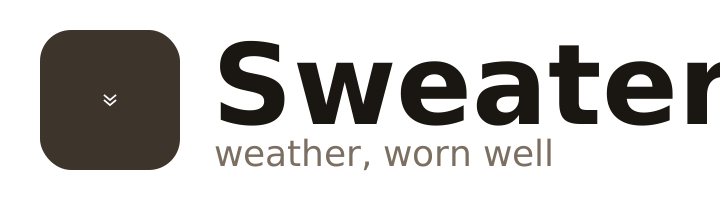
Lockup — light
Tile + wordmark on transparent. SVG needs Cormorant Garamond installed; PNG is pre-rendered.



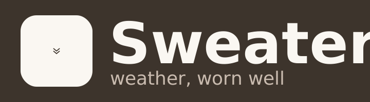
Lockup — dark (on espresso)
Inverted lockup for dark surfaces: cream tile + chevron, cream wordmark on espresso.



Asset index
14 files in the .zip
| Filename | Format | Dimensions | Size |
|---|---|---|---|
| Mark (square) | |||
| mark-256.svg | SVG | 256 × 256 | 433 B |
| mark-512.svg | SVG | 512 × 512 | 438 B |
| mark-1024.svg | SVG | 1024 × 1024 | 444 B |
| mark-256.png | PNG | 256 × 256 | 3.8 KB |
| mark-512.png | PNG | 512 × 512 | 7.9 KB |
| mark-1024.png | PNG | 1024 × 1024 | 18.8 KB |
| Lockup — light | |||
| lockup.svg | SVG | 1050 × 200 | 759 B |
| lockup-800.png | PNG | 800 × 152 | 14.7 KB |
| lockup-1600.png | PNG | 1600 × 305 | 31.9 KB |
| lockup-2400.png | PNG | 2400 × 457 | 51.4 KB |
| Lockup — dark | |||
| lockup-dark.svg | SVG | 1050 × 200 | 809 B |
| lockup-dark-800.png | PNG | 800 × 152 | 12.6 KB |
| lockup-dark-1600.png | PNG | 1600 × 305 | 28.0 KB |
| lockup-dark-2400.png | PNG | 2400 × 457 | 46.1 KB |
SVGs are vector (resolution-independent). Lockup SVGs reference Cormorant Garamond — install the font, or use the PNGs for portable sharing.
Color palette
Six tokens anchored on the espresso logo tile. Use the CSS custom properties (or the equivalent Tailwind brand-* classes) — never hard-code hex values in components.
Espresso
#3D342C
--brand-espresso
Logo tile, dark surfaces, primary buttons
Espresso Soft
#5C4F44
--brand-espresso-soft
Hover, secondary dark surfaces
Cream
#FAF7F2
--brand-cream
Primary page surface, cards
Ink
#1A1612
--brand-ink
Wordmark, h1/h2 on cream
Ink Muted
#7C6F62
--brand-ink-muted
Italic 'Weather', secondary copy
Warm
#C98B5A
--brand-warm
Accent, latte/amber highlights, CTAs
Typography
Three roles, three faces. Cormorant Garamond is the brand voice (wordmark only). Fraunces carries editorial display copy. Inter is the workhorse for UI and body text.
Brand — Cormorant Garamond 600 / 500 italic
--font-brandDisplay — Fraunces 500
--font-serifBody / UI — Inter 400
--font-sansDo
- ✓Use Cormorant only for the wordmark and brand-voice headings on marketing pages.
- ✓Use Fraunces for editorial display copy (hero headlines, section openers).
- ✓Use Inter for all body, labels, buttons, and form copy.
Don't
- ✕Don't set body text in Cormorant — it's a display face.
- ✕Don't italicize both words of the wordmark.
- ✕Don't introduce a fourth font without updating these guidelines.
Spacing
We use Tailwind's 4px base scale. These are the rungs we lean on the most — match them rather than inventing new gaps.
Do
- ✓Stick to multiples of 4px (Tailwind's spacing scale).
- ✓Use space-y-12 between major content sections.
- ✓Pair the logo with 12px gap (gap-3) at default size.
Don't
- ✕Don't invent odd pixel values (e.g. 13px, 27px).
- ✕Don't crowd the lockup — keep at least one tile-height of clear space.